We recently redesigned the Growing Venture Solutions site and I was given the task of completing and theming the new design. This was only my second theming assignment and it was a tremendous challenge and learning experience; I'd like to use this post to pass on some of the resources that helped me along the way. Maybe they'll help someone else?
The original GVS site was running the Marvin theme; since we’ve been growing it was time for a custom look. The first passes at the design and new logo were done by Don Hajicek and everyone was pleased with the overall style and particularly the leaves on the logo and on the “more” links. When I joined GVS I continued where Don left off by expanding his design to include more content elements, adding the navigation tabs and the footer area. (I like the little set apart yellow tab, although we're not sure if that color choice will stay.) I then moved on to Adventures in Theming.
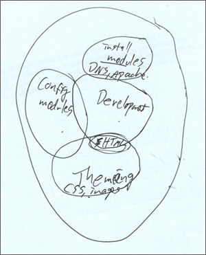
 Adventures, indeed. This image is a diagram Greg drew for me to explain the roles of the system administrator, site builder, developer, and designer. (“There are these overlapping bubbles, see?”) This pretty much sums up where I was starting from.
About a week in, when I was near the nadir of my learning curve confidence, I found this on Nick Lewis' site and I felt some relief; I was not alone: "When you first start, its going to suck: its going to be both boring, and confusing. Can you endure the unpleasant experience of watching yourself suck, while both confused and bored?"
