GVS is now part of Acquia. 
Usability Testing of Ubercart and Uc_signup
Ezra Glidesgame has been writing a module to integrate the Signup module for managing event registration with the Ubercart e-commerce module: Signup integration for Ubercart (short name: uc_signup). The uc_signup registration process was designed to support a wide variety of use cases (one user potentially signing up multiple other users for different events, in different quantities) while still being easy to use. We wanted to see what users thought of the preliminary uc_signup registration process, so in June we ran a small usability test here at the Growing Venture Solutions office. The test revealed several subtle and interesting findings that applied to the uc_signup module, the Ubercart checkout process, and specific aspects of the client site's configuration.
First, some background on the project
AUSSIE provides professional development in the field of K-12 education. One of their services is to offer workshops around the country, with registration done through their website. Uc_signup is being written to give AUSSIE more control of the look and administration of their sign-up process, and internalize their events management, which is currently being hosted by Eventbrite. The improved Aussie site is scheduled to launch in August.
About our Usability Participants
We recruited 4 participants having the following profile characteristics:
- Two men and two women between the ages of 29-36
- All with general office experience and good computer proficiency
- All use the internet daily, with a range of 3 to 40 hours per week
- Internet purchasing comfort level: comfortable to strongly prefer
- Three of the participants had previously signed up online for classes or workshops
Participants were recruited prior to testing with the assistance of requests to FFF (“Friends of Friend and Family”). Participants were compensated $50 for their time. (Read this article about tester compensation.)
Where/How
We hosted the tests in our office, running a scaled back development version of the AussiePD site. We used Camtasia Studio for screen and audio/video capture. Present at each session were the moderator (me) and 1 to 2 observers.
Collected data:
- Participant background information, and their internet usage experience
- Observation of tasks performed – errors, obstacles, comments
- Participants’ impression of the sign-up process – in discussion and in writing
Test & Findings:
Participants were asked to sign up and purchase tickets for two fictional workshops. The overall task performance was successful; each participant was able to complete the tasks within the expected time frame. In post-test discussions and surveys, participants all agreed that the sign-up and checkout process were what they expected and typical of what they’ve used in other online purchasing experiences.
However, all participants made similar minor errors and/or encountered obstacles, with varying degrees of recovery.
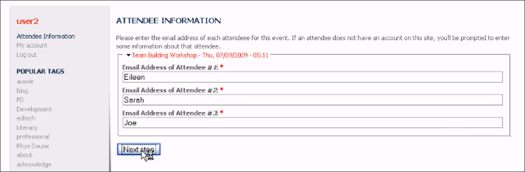
Finding #1- Purchaser not entering atendee e-mail addresses
On the first registration screen users are asked to enter an e-mail address for each person attending the workshop. One user simply entered the attendees' names and because uc_signup was still in relatively early development, the submission went through unchallenged.
Suggested fixes:
1. Change the screen title from “Attendee Information” to “Attendee E-mail Addresses”.
2. Validate the information entered.
* FIXED: http://drupal.org/node/525542
Finding #2 - Entering full name in “First Name” profile field
For every email address entered that does not have a corresponding account on the Drupal site, uc_signup allows the purchaser to fill out the configured core Profile fields and create a new account. Without custom theming, the first and last name profile fields appeared on different lines.
Three of four participants entered full names in the “First name” field and had to correct themselves after they tabbed down and saw the “Last name” field. Two participants made this error more than once.

Suggested fix:
We recommended that this page be themed so that the first and last name fields are on the same line. Since these fields are configurable Profile module fields, they are specific to the AUSSIE project.
Finding #3 - "Previous" is the default submit button on the multi-step attendee information form
Next/Previous step buttons appear at the bottom of the 2-step attendee information form. Because the "previous" button was the first in the form, it became the default submit button. That meant that users would enter information, press enter expecting to go to the next step, and get sent to the previous one.
Suggested fix:
As a short term fix, we reversed the order of these two buttons. However, that results in an awkward button order for left-to-right readers.
A better long term solution exists as part of the issue mentioned below, which proposes making each step of the form appear at its own path.
- Posted issue: http://drupal.org/node/540136
Finding #4 – Purchaser Confusing “Country” drop-down for “State” drop-down
On the Ubercart's “Delivery Information” pane, three participants mistook the “Country” drop-down box for a “State” drop-down box, inadvertently selecting “Canada” (presumably because they were looking for a word starting with the letter “C” for “Colorado”.)

Confusion can also be attributed to the fact that it is more typical to find the country selector, if there is one, to be the last line of an address sequence.
Suggested fixes:
1. Since “Country” needs to precede “State/Province” in order to populate states and provinces, we suggest moving the “Country” drop-down out of the address sequence – perhaps before the Attendee name, or
2. Replace pre-populated City and Country dropdowns with text fields, eliminating the state/province field's dependence on the country field.
* Posted issue: http://drupal.org/node/529108
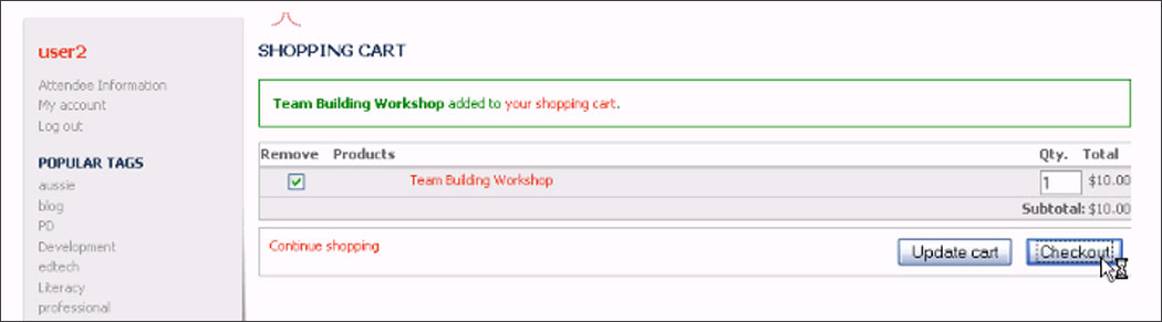
Finding #5 – Purchaser Unintentionally clicking “Remove” checkbox
When viewing their workshop in the shopping cart page, two participants clicked the "Remove" box next to the item, as if to confirm the selection.
Suggested fixes:
1. Move the location of the “Remove” checkbox to the left of the “Qty.” so that it is more visually connected to the idea of quantity, and/or
2. Perhaps change the word “Remove” to something like: “Remove?” or “Delete?” to make it appear less like a confirmation selection, or
3. Replace the remove checkbox with a "remove" button, like on Amazon.com.
* Posted issue: http://drupal.org/node/529110
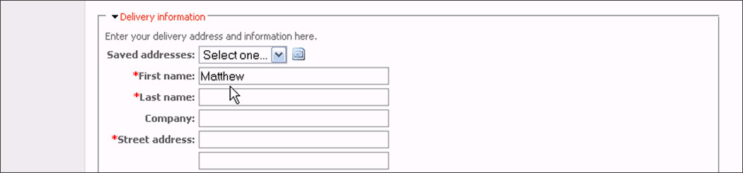
Finding #6 – Ubercart: Purchasers miss the “Saved Addresses” option
On the Checkout screen, in the “Delivery Information” pane, two participants repeatedly missed the "Saved Addresses" option and manually re-entered their billing name and address.
Suggested fixes:
1. Add more default styling to highlight the text “Saved addresses”, and/or
2. Add space underneath that line, thereby drawing attention to it, or
3. On the checkout page, show the most recently used address (if there is one) and provide a "Change" button that goes to a page showing all the saved addresses, as well as a new address field set, similar to Amazon.com
* Posted issue: http://drupal.org/node/529130
Usability testing results in surprises and best practices
Overall, the workflow for collecting attendee information proved to be successful. Still, no matter how much you think through a workflow when you're designing it, real-world users will are likely to surprise you by finding potential improvements that you may have missed. In the course of watching participants use the uc_signup module, we learned some other valuable lessons - “rules-of-thumb” that are important to improving the general work flow for all modules and design situations. One example from Greg is to pre-fill data whenever possible. Evelyn was reminded of the importance of label names.
This project is a collaboration working with Andy Hieb at Dtek Digital Media, and sponsored by client Australian United States Services in Education (AUSSIE). This is also an example of how community minded clients and companies can collaborate to get better results for their end-users while improving community software for everyone. All of us at GVS, Dtek and AUSSIE are excited to help make a useful new contributed module possible, and do usability testing to seek improvements for the software we share. Uc_signup currently has a stable beta release, and issues found in our usability test have either already been fixed, or are in the queue waiting to be fixed.
- Login to post comments
GVS projects
GVS is now part of Acquia.
Contact Acquia if you are interested in a Drupal Support or help with any products GVS offered such as the Conference Organizing Distribution (COD).
We Wrote the Book On Drupal Security: