Hello - I'm Evelyn and I have recently joined GVS as a designer and usability tester. I have been working as a freelancer for the past seven years, and now that my daughter is entering 1st grade I am excited to be spending more face time with grown-ups!
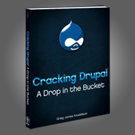
My first task as a designer with GVS was to design a site for Greg's book: "Cracking Drupal". This was also my first real-world experience theming for Drupal and with some help, it was pretty simple.
I began by chatting with Greg about what he wanted the site to do and how it should look. I also gave him a simple design worksheet to complete with questions such as "Who is your target audience?" and "How do you want people to describe your site?" (If I could ask only one question, this last one would be it.) Greg wanted the site to draw on the cover of the book, and wanted it to be elegant, streamlined and easy to navigate.
Book Cover: As a starting point it was an obvious choice to take the book cover and modify it into the header and footer. I pulled the color palette from the cover as well, and added a burnt orange accent to offset the strong blues and blacks. In general I try to avoid black text on white, so the body copy and some headers are actually a dark blue.
Elegant: I always strive for elegance. By elegance I don't mean just "tasteful, refined or dignified" (Oxford American Dictionary.) For me, elegance in web design is integral to good usability. Even grungy, busy sites, when done well, can be described as elegant. So for Cracking Drupal that meant a clear hierarchy and harmonious color scheme taken from the book.

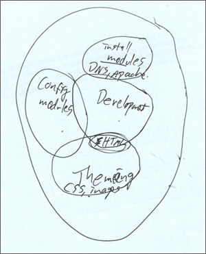 Adventures, indeed. This image is a diagram Greg drew for me to explain the roles of the system administrator, site builder, developer, and designer. (“There are these overlapping bubbles, see?”) This pretty much sums up where I was starting from.